How to Read Crypto Candlestick Charts: A Step-by-Step Guide
Candlestick charts are the most widely used tool for visualizing cryptocurrency price data. Whether you are tracking Bitcoin, Ethereum, or any altcoin, learning to read these charts is the foundation of every informed market observation. This step-by-step guide will take you from zero to confidently reading candlestick charts, understanding patterns, and combining them with technical indicators.
Why Candlestick Charts Matter in Crypto
Cryptocurrency markets move fast. Prices can swing 10% or more in a single day, and markets never close. In this environment, candlestick charts give you a structured, visual way to process price information quickly. Developed by Japanese rice traders in the 18th century, candlestick charts have stood the test of time because they pack an extraordinary amount of information into each data point.
Unlike simple line charts that only show closing prices, candlestick charts reveal the full story of each trading period: where the price opened, how high and low it went, and where it closed. This context is essential for understanding not just what happened, but how it happened and what it might mean for the next move.
What You Will Learn
- How to read the four data points in every candlestick (OHLC)
- The difference between bullish and bearish candles
- How to identify single-candle and multi-candle patterns
- How to use support, resistance, volume, and timeframes
- How to combine candlesticks with RSI (Relative Strength Index) and EMA indicators
- How to spot potential trend reversals
1 Understand What a Candlestick Represents (OHLC)
Every single candlestick on a crypto chart represents a specific time period—it could be one minute, one hour, four hours, one day, or one week, depending on the timeframe you choose. Regardless of the timeframe, each candlestick encodes exactly four pieces of price data, collectively known as OHLC:
- Open (O): The price at the very beginning of the time period. This is where trading started when the candle began forming.
- High (H): The highest price reached at any point during the time period. This is represented by the top of the upper wick.
- Low (L): The lowest price reached during the time period. This is represented by the bottom of the lower wick.
- Close (C): The price at the very end of the time period. This is the final price recorded before the next candle begins.
The thick rectangular middle section of the candlestick is called the body. It represents the range between the open and close prices. The thin lines extending above and below the body are called wicks (also known as shadows or tails). The upper wick stretches from the body to the high, and the lower wick stretches from the body to the low.
Here is how to think about it: the body tells you where the sustained trading activity was concentrated, while the wicks reveal the extremes that the price briefly touched but could not hold.
Quick Reference: Candlestick Anatomy
Long body = strong buying or selling pressure during the period. Short body = relatively little price movement between open and close. Long upper wick = sellers pushed the price back down from a higher level. Long lower wick = buyers pushed the price back up from a lower level. No wick = the open or close was also the high or low for the period.
2 Read Bullish vs. Bearish Candles
The color of a candlestick tells you immediately whether the price went up or down during that period. This is the most fundamental reading skill you need.
A green (bullish) candle means the closing price was higher than the opening price. The asset gained value during that time period. On a green candle, the open is at the bottom of the body and the close is at the top. The market sentiment during this period was net positive—buyers were in control.
A red (bearish) candle means the closing price was lower than the opening price. The asset lost value. On a red candle, the open is at the top of the body and the close is at the bottom. Sellers dominated during this period.
The size of the body matters just as much as the color. A large green candle shows strong bullish momentum—buyers overwhelmed sellers convincingly. A small green candle shows that while buyers won, the victory was marginal. The same logic applies in reverse for red candles.
Common Beginner Mistake
Do not assume that a single green candle means the trend is bullish, or that a single red candle means the trend is bearish. You need to look at the sequence of candles and the broader context. A single candle is just one data point. The trend is determined by the pattern across many candles.
3 Identify Common Single-Candle Patterns
Certain candlestick shapes appear frequently and carry specific implications. Learning to recognize these three foundational patterns will sharpen your chart reading immediately.
Doji
A doji forms when the open and close prices are virtually identical, creating a candle with a very thin or nonexistent body. It looks like a cross or a plus sign. The doji signals market indecision—neither buyers nor sellers could gain control during the period.
A doji is especially significant when it appears after a strong trend. After a series of large green candles, a doji suggests that buying momentum is fading. After a series of large red candles, it suggests selling pressure is exhausting. The wicks of a doji tell you how volatile the indecision was—long wicks mean the price swung widely before settling near the open.
Hammer
A hammer has a small body near the top of the candle and a long lower wick that is at least twice the length of the body. There is little or no upper wick. The color of the body matters less than the shape.
The hammer tells a story: during the period, sellers pushed the price down significantly (creating the long lower wick), but buyers fought back and drove the price back up near the open. When a hammer appears at the bottom of a downtrend, it suggests a potential bullish reversal—sellers tried to push lower but failed.
Shooting Star
The shooting star is the inverse of the hammer. It has a small body near the bottom of the candle and a long upper wick. It tells you that buyers pushed the price up during the period, but sellers took over and drove it back down near the open.
When a shooting star appears at the top of an uptrend, it signals a potential bearish reversal. The long upper wick reveals that the price tested higher levels but was rejected—a sign that buying pressure may be weakening.
4 Recognize Multi-Candle Patterns
While single-candle patterns are useful, some of the most powerful signals come from patterns formed by two or more consecutive candles. These patterns gain their significance from the relationship between candles.
Bullish Engulfing
A bullish engulfing pattern consists of two candles: a small red candle followed by a large green candle whose body completely covers (engulfs) the body of the previous red candle. This pattern suggests a decisive shift from selling to buying pressure.
The message is clear: whatever selling occurred in the first period was completely overwhelmed by buying in the second period. When this pattern appears at the bottom of a downtrend or at a support level, it is considered a strong bullish signal.
Bearish Engulfing
The mirror image of the bullish engulfing: a small green candle followed by a large red candle that engulfs it. This appears at the top of uptrends and signals that sellers have taken control. The large red body shows that selling pressure dramatically exceeded the previous period's buying activity.
Morning Star
The morning star is a three-candle reversal pattern. First, a large red candle confirms the existing downtrend. Second, a small-bodied candle (of either color) shows indecision—the selling momentum has stalled. Third, a large green candle that closes well into the body of the first red candle confirms the reversal.
The morning star is named because it appears before the "sunrise" of a new uptrend. Its bearish counterpart is the evening star, which forms at the top of uptrends with the pattern reversed.
Pattern Reliability Tip
Multi-candle patterns are generally more reliable than single-candle patterns because they show a confirmed shift in market sentiment over multiple periods. However, always look for additional confirmation from volume, support and resistance levels, or technical indicators before acting on any pattern alone.
5 Read Support and Resistance Levels
Support and resistance are among the most fundamental concepts in chart reading. They represent price levels where historical buying or selling pressure has been strong enough to reverse or stall price movements.
Support is a price level where the asset has repeatedly found buying interest. Think of it as a floor: every time the price drops to this level, buyers step in and push it back up. To identify support, look for price levels where two or more candle lows cluster around the same horizontal area.
Resistance is the opposite—a price ceiling where selling pressure has historically been strong enough to stop the price from rising further. When the price approaches resistance, sellers tend to take profits or open short positions, pushing the price back down.
How to Draw Support and Resistance
- Zoom out to see more historical price data
- Identify areas where the price has bounced upward at least twice (support) or been rejected downward at least twice (resistance)
- Draw a horizontal line through these price points
- Treat these as zones rather than exact lines—the market rarely bounces at precisely the same price twice
One of the most important principles in technical analysis is that when support breaks, it often becomes resistance, and vice versa. For example, if Bitcoin has support at $60,000 and the price breaks below it, that $60,000 level will often act as resistance on any subsequent rally attempt.
In crypto markets, round numbers like $50,000, $100,000, or $1.00 frequently act as strong psychological support and resistance levels because traders tend to place buy and sell orders at these memorable price points.
Watch for False Breakouts
Sometimes the price will briefly break through a support or resistance level only to reverse and move back in the opposite direction. These "fakeouts" are common in crypto due to high volatility. Wait for a candle to close convincingly beyond the level before concluding that it has been broken. A breakout confirmed by high volume is far more reliable than one on low volume.
6 Use Volume Alongside Candlesticks
Volume is the number of units of a cryptocurrency traded during a given time period. On most charts, volume is displayed as vertical bars at the bottom, directly beneath the corresponding candlestick. Volume is the missing piece that tells you how much conviction is behind a price move.
Why Volume Matters
Price tells you what happened. Volume tells you how significant it was. A large green candle on high volume means many participants are buying—the move has broad support. A large green candle on low volume means fewer participants are involved, and the move may lack staying power.
Key Volume Principles
- High volume on breakouts confirms the move. When the price breaks through a resistance level on volume significantly above average, the breakout is more likely to be genuine and sustained.
- Low volume on a rally is a warning sign. If the price keeps rising but volume is declining, it suggests fewer new buyers are entering. The rally may be running out of fuel.
- Volume spikes at reversals. Major trend reversals are often accompanied by a sudden spike in volume. This represents a climactic battle between buyers and sellers where one side decisively takes control.
- Consolidation shows declining volume. When the price is moving sideways in a narrow range, volume typically shrinks. This quiet period often precedes a significant breakout in one direction.
Volume Divergence
One of the most powerful volume signals is divergence. If the price is making new highs but volume is declining with each successive high, it warns that the uptrend is losing participation. Conversely, if the price is making new lows but volume is decreasing, selling pressure may be exhausting—a potential bottoming signal.
7 Apply Timeframe Analysis
The timeframe you choose fundamentally changes what each candlestick represents. A 5-minute candle shows you what happened in five minutes. A daily candle summarizes an entire 24-hour period. Choosing the right timeframe—and using multiple timeframes together—is essential for accurate chart reading.
Common Timeframes and Their Uses
- 5-minute and 15-minute charts: Used for very short-term observations. These show rapid price action and are noisy with many false signals. Useful for timing entries and exits on small moves, but patterns here are less reliable.
- 1-hour chart: A good intermediate timeframe that filters out some noise while still showing intraday movements. Popular for studying short-term trends that develop over a few hours to a few days.
- 4-hour chart: Widely considered the sweet spot for crypto analysis. It smooths out intraday noise while still being responsive to emerging trends. Many experienced analysts use the 4-hour chart as their primary view.
- Daily chart (1D): Each candle represents a full 24-hour period. This is the standard timeframe for identifying medium to long-term trends. Patterns on the daily chart are significantly more reliable than on lower timeframes.
- Weekly chart (1W): Each candle represents an entire week. Used for identifying macro trends and long-term support and resistance. The weekly chart removes most noise and shows you the big picture.
Multi-Timeframe Analysis
Professional analysts never rely on a single timeframe. The standard approach is top-down analysis: start with a higher timeframe to identify the overall trend, then move to lower timeframes for detail.
- Check the weekly chart to determine the macro trend direction
- Move to the daily chart to identify key support, resistance, and patterns
- Use the 4-hour or 1-hour chart to study recent price action in detail
- Refer to shorter timeframes only if you need granular entry or exit timing
Timeframe Analysis Checklist
- Identified the macro trend on the weekly or daily chart
- Confirmed the trend direction aligns across at least two timeframes
- Noted key support and resistance levels visible on multiple timeframes
- Using higher timeframes for pattern recognition, lower for detail
- Not over-analyzing 5-minute charts for long-term observations
8 Combine Candlesticks with Indicators (RSI and EMA)
Candlestick charts on their own tell a compelling story, but combining them with technical indicators adds quantitative depth. Two of the most useful indicators for crypto chart reading are the Relative Strength Index (RSI) and Exponential Moving Averages (EMA).
RSI (Relative Strength Index)
The RSI measures the speed and magnitude of recent price changes and outputs a value between 0 and 100. It helps you determine whether an asset might be overbought (RSI above 70) or oversold (RSI below 30).
How to use RSI with candlesticks: If you see a hammer candle at a support level and the RSI is below 30, you have two independent signals pointing toward a potential bounce. That is much more meaningful than either signal alone. Conversely, a shooting star at resistance with RSI above 70 provides double confirmation of a possible pullback.
RSI divergence is one of the most reliable signals in technical analysis. If the price makes a higher high but the RSI makes a lower high, momentum is fading despite the price increase. This bearish divergence often precedes a reversal. The opposite—price making lower lows while RSI makes higher lows—is bullish divergence.
EMA (Exponential Moving Average)
An EMA calculates the average closing price over a specified number of periods, giving more weight to recent prices. This makes it more responsive to new price data than a Simple Moving Average (SMA).
Common EMAs and their uses:
- 20 EMA: Tracks short-term momentum. In an uptrend, the price tends to stay above the 20 EMA. When it dips to touch the 20 EMA and bounces, it often represents a buying opportunity within the trend.
- 50 EMA: Represents the intermediate trend. A cross of the 20 EMA above the 50 EMA is considered a bullish signal.
- 200 EMA: The long-term trend indicator. The price trading above the 200 EMA is broadly considered bullish; below it is bearish. The "golden cross" (50 EMA crossing above 200 EMA) and "death cross" (50 EMA crossing below 200 EMA) are widely watched signals.
How to use EMAs with candlesticks: EMAs act as dynamic support and resistance. In an uptrend, watch for bullish candlestick patterns (hammers, bullish engulfing) to form right at a rising EMA. This confluence of price action and indicator support strengthens the signal considerably.
9 Spot Trend Reversals
One of the most valuable skills in chart reading is recognizing when a trend may be about to change direction. Reversals do not happen suddenly—they develop through a sequence of signals that you can learn to read by combining everything covered so far.
Signs of a Potential Bullish Reversal (Downtrend Ending)
- Price approaches a major support level or zone
- A hammer or bullish engulfing pattern forms at that support
- RSI is in oversold territory (below 30) or showing bullish divergence
- Volume spikes on the bullish candle, suggesting strong buyer participation
- Price begins to reclaim a key EMA (such as the 20 or 50 EMA)
Signs of a Potential Bearish Reversal (Uptrend Ending)
- Price reaches a major resistance level or zone
- A shooting star or bearish engulfing pattern forms at resistance
- RSI is overbought (above 70) or showing bearish divergence
- Volume is declining on each successive high (weakening momentum)
- Price breaks below a key EMA that was previously acting as support
No Signal Is Guaranteed
- Trend reversals are probabilistic, not certain. Even the strongest confluence of signals can fail.
- Always consider the broader market context. In crypto, market-wide sentiment (driven by news, regulation, or macro events) can override technical signals.
- The more confirming signals you have pointing in the same direction, the higher the probability—but it is never 100%.
- Never rely on a single indicator or pattern in isolation to call a reversal.
Reversal Confirmation Checklist
- Identified a reversal candlestick pattern at a key level
- RSI confirms with overbought/oversold reading or divergence
- Volume supports the reversal signal
- Price action is confirmed on at least two timeframes
- The broader market context does not contradict the signal
10 Practice with a Portfolio Tracker
Reading about chart patterns and indicators is important, but the real learning happens when you apply these concepts to actual cryptocurrency charts. Theory without practice leads to slow progress. You need to look at real candles, real volume, and real indicator readings to develop the pattern recognition that makes chart reading second nature.
The best way to practice is with a tool that gives you interactive charts alongside clear explanations. That is exactly what ChartScope is designed for. Instead of switching between a tutorial and a charting platform, you can learn directly on the chart with on-device AI that explains what you are seeing in plain language.
How to Practice Effectively
- Start with daily charts. They are easier to read than lower timeframes because there is less noise. Pick a major cryptocurrency like Bitcoin or Ethereum.
- Identify one pattern at a time. Spend a week looking for nothing but dojis, then a week focused on engulfing patterns. Specialization builds confidence.
- Mark support and resistance levels before you look at current price action. Then observe how the price behaves when it reaches those levels.
- Add one indicator at a time. Start with just the RSI. Once you are comfortable reading RSI alongside candlesticks, add the 20 and 200 EMA.
- Review historical charts. Scroll back in time and see if you can identify patterns that preceded major moves. This builds your visual library.
Why ChartScope Is Built for Learning
- On-device AI: All analysis runs locally on your iPhone using Apple Core ML—your data never leaves your device
- Interactive charts: Tap on any candle, pattern, or indicator to get a clear, context-aware explanation
- Multi-exchange support: Connect to Binance, Coinbase, and Kraken to study real market data
- Multiple timeframes: Switch between 5-minute and weekly charts to practice multi-timeframe analysis
- Privacy-first: No tracking, no analytics, no data collection—just educational tools
Start Reading Crypto Charts Today
Download ChartScope and practice candlestick chart reading with AI-powered explanations on real market data. Free 3-day trial included.
Download on the App StoreQuick Reference: Chart Reading at a Glance
Your 10-Step Chart Reading Process
- Read each candlestick's OHLC data to understand the full price story
- Note the color and body size to gauge bullish or bearish momentum
- Scan for single-candle patterns (doji, hammer, shooting star)
- Look for multi-candle patterns (engulfing, morning star, evening star)
- Identify and draw support and resistance levels
- Check volume to confirm the conviction behind price moves
- Use multiple timeframes to align your analysis from macro to micro
- Layer RSI and EMA indicators for quantitative confirmation
- Combine multiple signals to spot potential trend reversals
- Practice consistently on real charts to build pattern recognition
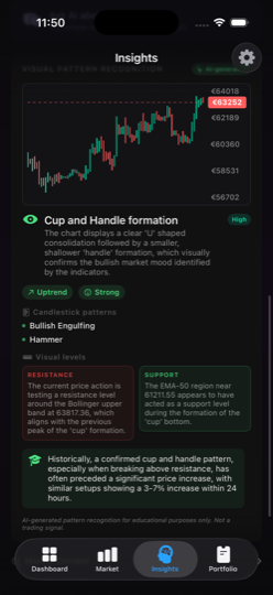
Reading Candlestick Patterns with ChartScope's AI Vision: A Step-by-Step Walkthrough
Understanding candlestick theory is one thing — seeing it applied to your actual chart in real time is another. This section walks through exactly what ChartScope's AI outputs when it processes a chart screenshot, so you know what to expect and how to build on its explanations.
What AI Vision Identifies on a Candlestick Chart
ChartScope's AI Vision feature uses a multimodal vision model to analyse the last 80 candles of whichever chart you screenshot. It identifies and labels:
- Single-candle patterns: Doji (standard, dragonfly, gravestone), hammer, inverted hammer, shooting star, spinning top, marubozu (full-body candles with no wicks, indicating strong momentum)
- Two-candle patterns: Bullish engulfing, bearish engulfing, harami (inside bar), piercing line, dark cloud cover
- Three-candle patterns: Morning star, evening star, three white soldiers, three black crows
- Structural patterns: Support/resistance zones visible in the price history, trend lines where multiple candle bodies or wicks align
For each pattern it finds, the AI provides a plain-language explanation of what the pattern historically suggests about market sentiment — always framed as educational context, never as a trading signal.
Example AI Vision Output: Shooting Star at Resistance
When AI Vision detects a shooting star near a prior resistance level, the output reads something like:
"A Shooting Star candlestick pattern is visible on the most recent candle. This pattern has a small real body near the low of the candle's range and a long upper wick, indicating that buyers pushed the price significantly higher during the period, but sellers regained control before the close. When this pattern appears near a prior resistance zone (visible at approximately the same price level 12 candles ago), it historically suggests that buying pressure is weakening. This is one signal among many — confirm with volume and momentum indicators before drawing conclusions."
Notice what the output does and doesn't say: it names the pattern, explains the mechanics (who was in control when), gives structural context (near resistance), and explicitly defers to additional confirmation. This is the educational model — understanding the why behind a pattern, not receiving a binary signal.
Combining AI Vision with the 9 Insight Cards
AI Vision output becomes most powerful when combined with ChartScope's Enriched Insights cards. For the shooting star example above:
- Indicator Conflicts card: If RSI is at 72 (overbought) while the shooting star appears, the card notes both signals pointing to potential exhaustion — high confluence
- Market Mood card: A mood reading above 70/100 near a resistance-level shooting star tells you the market was bullish going into the pattern — making the reversal signal more significant than if mood was neutral
- Divergence card: If MACD histogram was already shrinking before the shooting star formed, the divergence card surfaces this as corroborating weakness — teaching you to look for confirmation across time
- Key Levels card: Shows the exact price of the nearest support below the shooting star — giving you the "if this fails, where does it go?" context that a candle pattern alone can't provide
What to Ask AI Chat After Seeing a Candlestick Pattern
The AI Chat feature is context-aware — it knows what coin and timeframe you're viewing. After AI Vision identifies a pattern, these follow-up questions produce the most educational responses:
- "Why does this hammer pattern matter more at the bottom of a downtrend than in the middle of one?"
- "I see three consecutive bearish candles — is that the same as three black crows?" (Teaches you the body-size and gap requirements)
- "The engulfing candle has a very long wick — does that change what it means?"
- "What volume would confirm this morning star pattern?"
Each answer builds conceptual understanding rather than giving you a directive — which is the only way to genuinely learn to read charts rather than pattern-match without understanding.
Important Disclaimer
This article is for educational purposes only and does not constitute financial advice, investment recommendations, or trading signals. Cryptocurrency markets are highly volatile and carry significant risk. You could lose some or all of your invested capital.
Candlestick patterns and technical indicators are tools for studying historical price behavior. Past performance does not guarantee future results. No pattern, indicator, or analysis method can predict market movements with certainty.
ChartScope is an educational tool designed to help you learn about technical analysis concepts. It does not provide financial advice. Always conduct your own research and consult with a qualified financial advisor before making any investment decisions.