Technical Analysis for Crypto Beginners: A Complete Guide
New to cryptocurrency markets? Technical analysis might sound intimidating, but it does not have to be. This guide breaks down everything you need to know to start reading charts, understanding indicators, and recognizing patterns—all in plain language that any beginner can follow.
What Is Technical Analysis?
Technical analysis is a method of evaluating financial assets—in this case, cryptocurrencies—by studying historical price data and trading volume. Rather than looking at what a project does or who is behind it (that is fundamental analysis), technical analysis focuses entirely on the charts: the price movements, the patterns they form, and the signals that various mathematical indicators generate.
The core idea behind technical analysis is that market prices reflect all known information, and that price movements tend to follow identifiable trends and patterns. By learning to read these patterns, you can develop a better understanding of market behavior and make more informed observations about where prices might be headed.
For crypto beginners, technical analysis provides a structured framework to study markets methodically instead of relying on gut feelings or social media hype. It gives you a vocabulary and a set of tools to describe what is happening on a chart, which is the first step toward understanding market dynamics.
Why Learn Technical Analysis for Crypto?
- Cryptocurrency markets trade 24/7, making real-time chart reading especially valuable
- Crypto markets are highly volatile, and technical analysis helps identify trends within the noise
- The same principles that work in stock markets apply to crypto, so these skills are transferable
- Understanding charts protects you from making emotional decisions based on fear or hype
Reading Candlestick Charts
If you have ever looked at a cryptocurrency price chart, you have likely seen candlestick charts. They are the most popular way to visualize price data, and for good reason: each candlestick packs a surprising amount of information into a single visual element.
Anatomy of a Candlestick
Every candlestick represents a specific time period—one minute, one hour, one day, or whatever timeframe you choose. Each one tells you four things about the price during that period:
- Open: The price at the beginning of the time period
- Close: The price at the end of the time period
- High: The highest price reached during the period
- Low: The lowest price reached during the period
The thick middle part of the candlestick is called the body. It represents the range between the open and close prices. The thin lines extending above and below the body are called wicks (or shadows), and they show the high and low prices for that period.
Green vs. Red Candles
The color of a candlestick tells you the direction of the price movement. A green (or bullish) candle means the price closed higher than it opened—the asset gained value during that period. A red (or bearish) candle means the price closed lower than it opened—the asset lost value.
By reading a sequence of candlesticks, you can quickly see whether the market is trending upward, downward, or moving sideways. Long bodies indicate strong buying or selling pressure, while short bodies suggest indecision. Long wicks reveal that the price was pushed in one direction but then pulled back, which can signal a potential reversal.
Common Candlestick Patterns
Certain candlestick formations appear repeatedly and have been given descriptive names by traders. A doji is a candle where the open and close are nearly identical, forming a cross shape—it signals market indecision. A hammer has a small body at the top and a long lower wick, suggesting that sellers pushed the price down but buyers fought back. An engulfing pattern occurs when a candle completely covers the body of the previous candle, often signaling a trend reversal.
Key Technical Indicators
Indicators are mathematical calculations applied to price and volume data. They help you quantify what the chart is showing and can highlight conditions that are not immediately obvious from the raw price action. Here are the four most important indicators that every crypto beginner should understand.
RSI (Relative Strength Index)
The RSI (Relative Strength Index) measures the speed and magnitude of recent price changes to determine whether an asset is overbought or oversold. It produces a value between 0 and 100.
When the RSI is above 70, the asset is generally considered overbought, meaning the price may have risen too quickly and could be due for a pullback. When the RSI is below 30, the asset is considered oversold, suggesting it may have fallen too far and could be ready for a bounce.
The RSI is particularly useful in crypto markets because of their extreme volatility. It helps you gauge whether a sharp price move is sustainable or if momentum is fading. However, during strong trends, the RSI can remain in overbought or oversold territory for extended periods, so it works best when combined with other indicators.
MACD (Moving Average Convergence Divergence)
The MACD is a trend-following momentum indicator that shows the relationship between two moving averages of an asset's price. It consists of three components: the MACD line (the difference between the 12-period and 26-period exponential moving averages), the signal line (a 9-period EMA of the MACD line), and the histogram (the difference between the MACD line and the signal line).
When the MACD line crosses above the signal line, it is considered a bullish signal, suggesting upward momentum is increasing. When it crosses below, it signals bearish momentum. The histogram visually represents the distance between the two lines, making it easy to see whether momentum is building or fading.
For crypto beginners, the MACD is valuable because it helps identify both the direction and strength of a trend. Watch for divergence between the MACD and the price—if the price makes new highs but the MACD does not, it could indicate weakening momentum.
Bollinger Bands
Bollinger Bands consist of three lines: a middle band (typically a 20-period simple moving average) and two outer bands set at two standard deviations above and below the middle band. This creates a dynamic envelope around the price that expands and contracts based on market volatility.
When the bands are wide, the market is volatile. When they squeeze together, volatility is low and a significant price move may be imminent. Prices that touch or break through the upper band may be overextended to the upside, while prices near the lower band may be stretched to the downside.
Bollinger Bands are especially useful in crypto because they adapt to the market's volatility. A "Bollinger squeeze"—when the bands get very narrow—often precedes a major breakout, making this one of the most watched setups in cryptocurrency trading.
Moving Averages (MA)
Moving averages smooth out price data by calculating the average closing price over a specified number of periods. The two most common types are the Simple Moving Average (SMA), which gives equal weight to all prices in the period, and the Exponential Moving Average (EMA), which gives more weight to recent prices.
Traders commonly watch the 50-day and 200-day moving averages. When the shorter-term moving average crosses above the longer-term one, it is called a "golden cross" and is considered bullish. The opposite—a "death cross"—is considered bearish.
Moving averages also act as dynamic support and resistance levels. In an uptrend, the price often bounces off a rising moving average. In a downtrend, the moving average can act as a ceiling that prevents the price from rising further. Understanding these dynamics gives you a clearer picture of the overall trend direction.
Common Chart Patterns
Beyond individual candlesticks and indicators, prices often form larger geometric patterns on the chart that can signal potential future moves. Learning to recognize these patterns is a core skill in technical analysis for crypto beginners.
Support and Resistance
Support is a price level where buying pressure has historically been strong enough to prevent the price from falling further. Think of it as a floor. Resistance is the opposite—a price ceiling where selling pressure has consistently pushed the price back down. These levels form the foundation of most chart analysis because they reveal where market participants have previously made decisions.
When a support level breaks, it often becomes resistance, and vice versa. In crypto markets, round numbers (like $50,000 for Bitcoin) frequently act as psychological support and resistance levels.
Head and Shoulders
This is one of the most reliable reversal patterns. It consists of three peaks: a higher peak (the head) between two lower peaks (the shoulders). When the price breaks below the "neckline" that connects the two troughs, it signals a potential downtrend. An inverse head and shoulders is the mirror image and signals a potential uptrend.
Double Tops and Double Bottoms
A double top forms when the price reaches the same high point twice but fails to break through, creating an "M" shape. It suggests that resistance is holding and a downturn may follow. A double bottom is the reverse: the price hits the same low twice and bounces up each time, forming a "W" shape and suggesting that support is holding strong.
Triangles
Triangle patterns form when the price range gradually narrows, creating converging trendlines. An ascending triangle (flat top, rising bottom) is typically bullish. A descending triangle (flat bottom, falling top) is typically bearish. A symmetrical triangle can break in either direction and simply indicates that a significant move is coming. In the volatile crypto market, triangle breakouts can lead to substantial price moves.
Pattern Recognition Tips
- No pattern works 100% of the time—always use them in combination with indicators
- Higher timeframes (daily, weekly) produce more reliable patterns than lower timeframes (minutes, hours)
- Volume confirms patterns: a breakout with high volume is more credible than one with low volume
- Practice identifying patterns on historical charts before applying them in real-time
Putting It All Together: Building Your Analysis Framework
Now that you understand the building blocks, the key is to combine them into a coherent analysis framework rather than relying on any single indicator or pattern in isolation. Here is a practical approach for beginners:
- Start with the big picture. Look at higher timeframes (daily or weekly charts) to identify the overall trend using moving averages. Is the price above or below the 200-day moving average?
- Identify key levels. Mark the nearest support and resistance levels on your chart. These are the boundaries within which the price is currently moving.
- Check momentum indicators. Use the RSI and MACD to gauge whether the current trend has strong momentum or is showing signs of exhaustion.
- Look for patterns. Are there any recognizable chart patterns forming? Is a triangle nearing its apex? Is there a double bottom at support?
- Assess volatility. Check the Bollinger Bands. Are they squeezing? Are they wide? This tells you whether a big move might be coming or if the market is already in a volatile phase.
Remember that technical analysis is about building a probabilistic view of the market, not predicting the future with certainty. The more evidence you gather from different tools pointing in the same direction, the stronger your analysis becomes.
Getting Started with ChartScope
Learning technical analysis concepts is one thing, but applying them to real cryptocurrency charts is where the real understanding develops. That is exactly what ChartScope is designed to help you do.
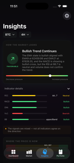
ChartScope is an educational iOS app that brings technical analysis to life with interactive charts and on-device AI explanations. Instead of just reading about what RSI means or how Bollinger Bands work, you can explore them directly on live crypto market data and get plain-language explanations from the AI assistant as you learn.
What Makes ChartScope Different
- On-device AI: All analysis runs locally on your iPhone using Apple Core ML—your data never leaves your device
- Interactive learning: Tap on any indicator to get a clear explanation of what it means in the current market context
- Multi-exchange support: Connect to Binance, Coinbase, and Kraken to study real market data across exchanges
- Privacy-first design: No tracking, no analytics, no data collection—just learning tools
Whether you are just learning to read your first candlestick chart or practicing pattern recognition on multiple timeframes, ChartScope provides the educational environment you need. And if you ever get stuck, the support team is happy to help.
Start Learning Technical Analysis Today
Download ChartScope and explore cryptocurrency charts with AI-powered explanations. Free 3-day trial included.
Download on the App StoreImportant Disclaimer
This article is for educational purposes only and does not constitute financial advice, investment recommendations, or trading signals. Cryptocurrency markets are highly volatile and carry significant risk. You could lose some or all of your invested capital.
Technical analysis is a study of historical price patterns and indicators. Past performance does not guarantee future results. No indicator, pattern, or analysis method can predict market movements with certainty.
ChartScope is an educational tool designed to help you learn about technical analysis concepts. It does not provide financial advice. Always conduct your own research and consult with a qualified financial advisor before making any investment decisions.