Tutorial on Analyzing Crypto Charts for Beginners: 2026 Guide

Tutorial on Analyzing Crypto Charts for Beginners: 2026 Guide
Learning to read crypto charts is one of the most valuable skills you can develop as a new investor. The reality is sobering: a widely cited 2022 study by the Bank for International Settlements found that roughly three-quarters of retail cryptocurrency investors lost money on their initial positions. While the exact figure is debated, the underlying lesson is clear—most newcomers jump in without understanding basic market structure.
This tutorial on analyzing crypto charts for beginners exists to close that gap. By learning to read candlesticks, spot trends, and interpret a few core indicators, you move from gambling to informed decision-making.
Last updated: 2026-09-09
Why Crypto Chart Analysis Matters for New Investors

You wouldn’t drive across a country without a map, yet many people buy crypto without ever looking at a price chart. Chart analysis is that map. It reveals market sentiment, historical support and resistance levels, and momentum shifts—information that helps you time entries and exits with more confidence.
The stakes are high. Cryptocurrency markets are famously volatile; Bitcoin has experienced multiple drawdowns exceeding 80% from its peaks. Without a framework for interpreting price action, new investors often panic-sell at bottoms or FOMO-buy at local tops. Technical analysis provides a structured, rules-based alternative to emotional reactions.
The Pain Point: Information Overload
Here is where most beginners get stuck. Open any trading platform and you are confronted with dozens of indicators—RSI, MACD, Bollinger Bands, Fibonacci retracements, Ichimoku Clouds—each with its own jargon. A 2024 survey by the CFA Institute found that over 60% of retail traders admit to using indicators they don’t fully understand. That confusion leads to analysis paralysis or, worse, reckless trades based on misunderstood signals.
The solution isn’t more data; it’s better explanations. A tutorial on analyzing crypto charts for beginners must prioritize comprehension over quantity. Learn three or four indicators deeply before expanding your toolkit.
What You’ll Actually Gain
By the end of this guide, you will be able to: - Identify a candlestick pattern and explain what it signals - Determine whether a market is trending or ranging - Use RSI and MACD to confirm (or question) what you see on the chart - Apply these skills consistently using a tool that explains its reasoning
This is a skill-building exercise, not a get-rich-quick scheme. As ChartScope states in its terms, all AI analysis represents pattern recognition, not financial advice. Approach this as education—because that’s exactly what it is.
Try a structured approach: pair this guide with a free trial of a charting app that explains concepts inline. Start your 3-day free trial →
Understanding Candlestick Patterns and Market Trends
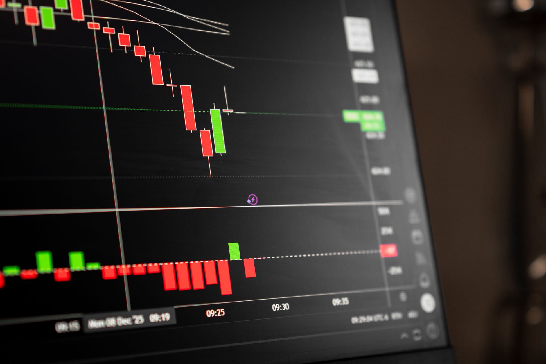
Candlestick charts are the language of technical analysis. Each “candle” tells a story about the battle between buyers and sellers during a specific time period. Originating from 18th-century Japanese rice trading, candlestick charting was popularized in the West by Steve Nison in the 1990s.
Anatomy of a Single Candle
Every candle has four key data points: - Open — price at the start of the period - Close — price at the end of the period - High — highest price reached - Low — lowest price reached
The rectangular body shows the range between open and close. The thin lines (wicks or shadows) extend to the high and low. A green (or white) candle means the close was higher than the open—buyers controlled the period. A red (or black) candle means the opposite—sellers dominated.
Three Patterns Every Beginner Must Know
You don’t need to memorize dozens of patterns. Start with these three, which appear frequently and carry meaningful signals:
| Pattern | Visual Cue | What It Suggests |
|---|---|---|
| Doji | Very small body, wicks on both sides | Indecision; a potential trend reversal or continuation pause |
| Bullish Engulfing | Small red candle followed by a large green candle that “swallows” the previous body | Buyers have taken control; potential upward reversal |
| Shooting Star | Small body at the bottom, long upper wick | Sellers rejected higher prices; potential downward reversal |
A single candle is just one data point. A Doji alone doesn’t mean “sell everything”—it means “pay attention.” Context matters. Look for patterns at key support or resistance levels, or after extended trends.
Trend Identification: The Foundation of All Analysis
Markets move in three directions: up (bull trend), down (bear trend), or sideways (range). Your first job on any chart is to identify which regime you’re in.
A simple method: 1. Look at the swing highs and lows. In an uptrend, each high is higher than the last, and each low is higher than the last. 2. Draw a trendline connecting the higher lows. If price respects this line, the uptrend is intact. 3. Check the 200-period moving average (if available). Price above it often indicates a longer-term bull trend; below it, a bear trend.
As legendary trader Jesse Livermore reportedly said, “The big money is not in the individual fluctuations but in the main movements.” Trend identification is how you align yourself with those main movements.
Pro tip: Instead of guessing, use a tool that explicitly classifies trends for you. ChartScope’s AI Vision can read a chart screenshot and identify patterns like Doji or Engulfing, confirming what you see with your own eyes.
Essential Technical Indicators for Beginners in 2026
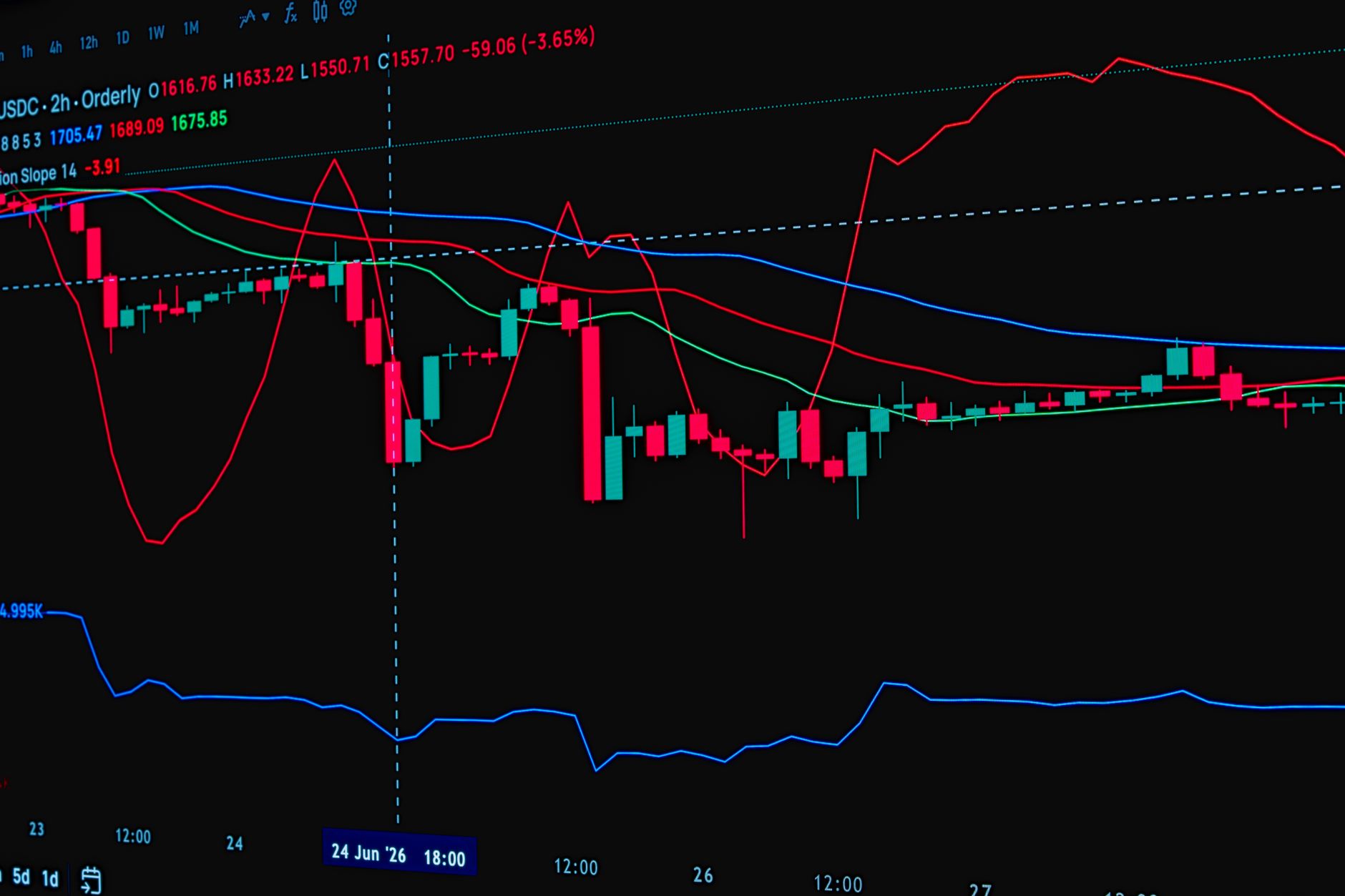
Indicators are mathematical calculations applied to price and volume data. They help you quantify what might otherwise be subjective. For beginners, mastering two or three core indicators is far more valuable than superficially knowing ten.
RSI (Relative Strength Index)
The RSI measures the speed and magnitude of recent price changes on a scale from 0 to 100. Developed by J. Welles Wilder in 1978, it remains one of the most popular momentum oscillators.
- Above 70 — often considered overbought; price may be due for a pullback
- Below 30 — often considered oversold; price may be due for a bounce
- 50 — the midline; values above suggest bullish momentum, below suggest bearish momentum
Key nuance: In a strong trend, RSI can stay overbought or oversold for extended periods. Don’t treat a reading above 70 as an automatic sell signal. Look for divergences—price making a higher high while RSI makes a lower high—which can signal weakening momentum.
MACD (Moving Average Convergence Divergence)
MACD shows the relationship between two exponential moving averages (typically the 12-period and 26-period). It consists of: - The MACD line (the difference between the two EMAs) - The signal line (a 9-period EMA of the MACD line) - The histogram (the difference between the MACD line and the signal line)
When the MACD line crosses above the signal line, it’s a bullish signal. A cross below is bearish. MACD is a lagging indicator—it confirms trends rather than predicting them—which makes it excellent for filtering out false moves.
Volume: The Forgotten Confirmation Tool
Volume isn’t an oscillator, but it’s arguably the most important confirmation tool you have. A price breakout on high volume is far more credible than one on thin volume. When you see a candlestick pattern or an indicator signal, always check volume for agreement.
A Comparison Table for Quick Reference
| Indicator | Type | Best For | Key Levels | Common Mistake |
|---|---|---|---|---|
| RSI | Momentum oscillator | Identifying overbought/oversold conditions | 30 / 70 | Selling immediately at 70+ |
| MACD | Trend-following momentum | Confirming trend direction & reversals | Signal line crossovers | Ignoring it in ranging markets |
| Volume | Confirmation | Verifying breakouts and patterns | Relative to recent average | Trading breakouts on low volume |
| Moving Averages | Trend filter | Identifying trend direction | 50 / 200 period | Using them alone without price context |
Note: These indicators are tools, not oracles. As ChartScope’s documentation emphasizes, indicators like RSI and MACD are explained “in plain language” for educational purposes—never as trading signals.
The 2026 Landscape: AI-Assisted Learning
In 2026, the barrier to learning these indicators has dropped dramatically. Mobile apps now offer on-device AI that can explain what a MACD crossover means right on your chart, in your language. This is a game-changer for beginners who previously had to bounce between a chart, a textbook, and a forum to piece together an answer.
How to Use ChartScope to Visualize Market Data

ChartScope positions itself as “the AI crypto tutor that explains your charts.” Unlike traditional dashboard apps that overwhelm you with raw data, ChartScope focuses on education. According to the official site, it’s built for beginners who want to understand what RSI, MACD, and candlestick patterns actually mean—in plain language, on their chart, in their language.
What the App Actually Does
ChartScope offers three premium features, all designed for learning rather than signal-chasing:
-
AI Chat — Ask anything about your chart and get answers in plain language. It’s a multi-turn conversational AI that is context-aware (it knows your current coin and timeframe). Crucially, it never gives signals—it always explains why. The system runs on a Groq + Gemini failover chain.
-
AI Vision — Upload a screenshot of your chart and the Vision LLM analyzes it visually. It identifies candlestick patterns (Doji, Engulfing, Shooting Star, etc.) and confirms or enriches text analysis. This feature requires separate consent, giving you control over visual AI independently.
-
Insights v6 — Nine structured cards that cover volatility, conflicts, risk/reward, and momentum. It includes a “Market Mood” thermometer on a 0-100 scale, indicator conflict detection, quantified risk/reward ratios, and momentum with volatility context.
Step-by-Step: Your First Chart Analysis Session
Here’s a practical workflow you can follow with ChartScope or any charting tool:
- Choose your coin and timeframe. Start with a liquid asset like Bitcoin or Ethereum on a 4-hour or daily chart. Longer timeframes produce cleaner signals for learning.
- Take a screenshot of your chart. Make sure it shows at least 50-100 candles for context.
- Open ChartScope’s AI Vision and upload the screenshot. Let it identify any candlestick patterns it sees.
- Ask a question in AI Chat. For example: “Is this an uptrend or a downtrend? What does the RSI tell me right now?”
- Review the Insights cards. Check the Market Mood thermometer and the indicator conflict detection. If RSI says overbought but MACD is bullish, that’s a conflict worth understanding.
- Write down what you learned. Even two sentences helps reinforce the lesson.
- Repeat daily. Consistency beats intensity.
Privacy and Architecture: Why It Matters for Learning
ChartScope distinguishes itself with a strict privacy architecture. According to the site’s privacy policy, all AI analysis and data processing occurs locally on your device using Apple’s Core ML framework. The company states it does not collect personal identification information, email addresses, location data, usage analytics, or your portfolio data.
The on-device ML uses CoreML trend classification that runs on your iPhone’s Neural Engine, with an inference time of about 1 millisecond. Zero data is sent for machine learning purposes. For learners who are privacy-conscious, this removes a significant barrier to practicing chart analysis freely.
Pricing and Access
ChartScope is available on the App Store for iOS 16+ at €4.99/month after a 3-day free trial. The app supports 9 languages and includes zero tracking. It’s worth noting the app is not free—but the trial period gives you enough time to work through this tutorial and see if the teaching style clicks for you.
Ready to practice what you’ve learned? Try ChartScope free for 3 days →
Building a Consistent Trading Routine for Long-Term Success
Reading this guide once won’t make you a chart analyst. Mastery requires repetition. The good news: you don’t need hours per day. Fifteen to twenty minutes of focused chart study is sufficient for most beginners.
The 15-Minute Daily Routine
Here’s a simple, repeatable checklist:
- Minutes 1-3: Open your charting app. Look at the daily chart for Bitcoin and one altcoin you’re interested in.
- Minutes 4-7: Identify the trend. Is it up, down, or sideways? Mark the most recent swing highs and lows.
- Minutes 8-11: Check RSI. Is it above 70, below 30, or in the neutral zone? Note any divergences.
- Minutes 12-15: Check MACD. Has there been a recent crossover? Is the histogram expanding or contracting?
- One sentence summary: Write down your read of the market. “BTC is in an uptrend, RSI is neutral at 55, MACD is bullish.”
Why Consistency Beats Intensity
A trader who studies charts for 15 minutes daily for a year accumulates over 90 hours of deliberate practice. That consistent exposure builds pattern recognition in ways that occasional 3-hour sessions cannot. Your brain needs repeated exposure to different market conditions—trends, ranges, crashes, rallies—to develop intuition.
Common Mistakes to Avoid
- Overtrading. Analysis is not a mandate to trade. Many beginners analyze a chart, spot a “signal,” and feel compelled to act. The signal might be valid, but the market context might be poor.
- Ignoring higher timeframes. A 15-minute chart might look bullish while the daily chart is clearly bearish. Always zoom out.
- Confirmation bias. You’ll naturally look for evidence that supports your existing position. Actively seek reasons your analysis might be wrong.
- Skipping the “why.” Memorizing that “RSI above 70 means overbought” is less useful than understanding why—because buying pressure has been extreme and may be exhausting itself.
The Role of Educational Tools
This is where an educational app like ChartScope earns its keep. Instead of just showing you a red MACD histogram, its AI explains what the histogram represents and why traders watch for crossovers. The “why” is what transforms rote memorization into genuine understanding.
Pair your daily routine with a tool that explains itself. Download ChartScope and let the AI tutor guide your first 10 sessions →
FAQ
What is the best way for beginners to start analyzing crypto charts in 2026?
The best approach combines structured education with daily practice. Begin by learning candlestick basics (open, close, high, low) and three core patterns: Doji, Engulfing, and Shooting Star. Then master two indicators—RSI and MACD—before expanding your toolkit. Use a charting app that explains concepts in plain language, and commit to 15 minutes of daily chart study. Consistency matters more than intensity.
Do I need advanced math skills to read crypto charts?
No. Technical analysis relies on visual pattern recognition and basic concepts like percentages and averages. You don’t need to calculate RSI or MACD by hand—your charting software does that. What you need is the ability to interpret what the numbers mean in context. The mathematical formulas behind indicators are less important than understanding their practical implications.
How can ChartScope help me improve my technical analysis skills?
ChartScope is an AI crypto tutor that explains charts in plain language. It offers three features: AI Chat for asking questions about your chart, AI Vision for analyzing chart screenshots and identifying candlestick patterns, and Insights v6 which provides nine structured cards covering volatility, momentum, and indicator conflicts. All processing happens on-device, and the app never provides trading signals—it focuses purely on education.
How often should beginners practice chart analysis?
Daily practice of 15-20 minutes is ideal. This consistent exposure helps you recognize patterns across different market conditions. If daily isn’t possible, aim for at least 4-5 sessions per week. The key is regularity—sporadic intensive study sessions are less effective than consistent short ones.
Is chart analysis a guarantee of trading success?
No. Chart analysis is a tool for understanding market context, not a crystal ball. Cryptocurrency markets are highly volatile and speculative, and past performance does not guarantee future results. ChartScope explicitly states its purpose is educational and informational only. Always consult with qualified financial advisors before making investment decisions.
Continue Learning
- Crypto Trading Strategies for Beginners: A Complete Guide
- How to Understand RSI and MACD Indicators: Simple 2026 Guide
- Best Free Crypto Education Apps Like Chartscope in 2026
Last updated: 2026-09-09. This article is for educational purposes only and does not constitute financial advice. Always conduct your own research before making investment decisions.